no! suga
This was a 4-month project, where we met with a client (via Zoom) and worked with them to expand upon their existing brand. We worked in a team of 6 and then broke into groups of 2. Our client was a multi-national sweets/confectionary company looking to create a new extension of her existing company. All the client had for us was a name and a few taglines. These are the pieces that I designed.

Client’s logo and tagline

The client wanted people to know that the products were made by a mom, so this is the icon I came up with to use on the packaging


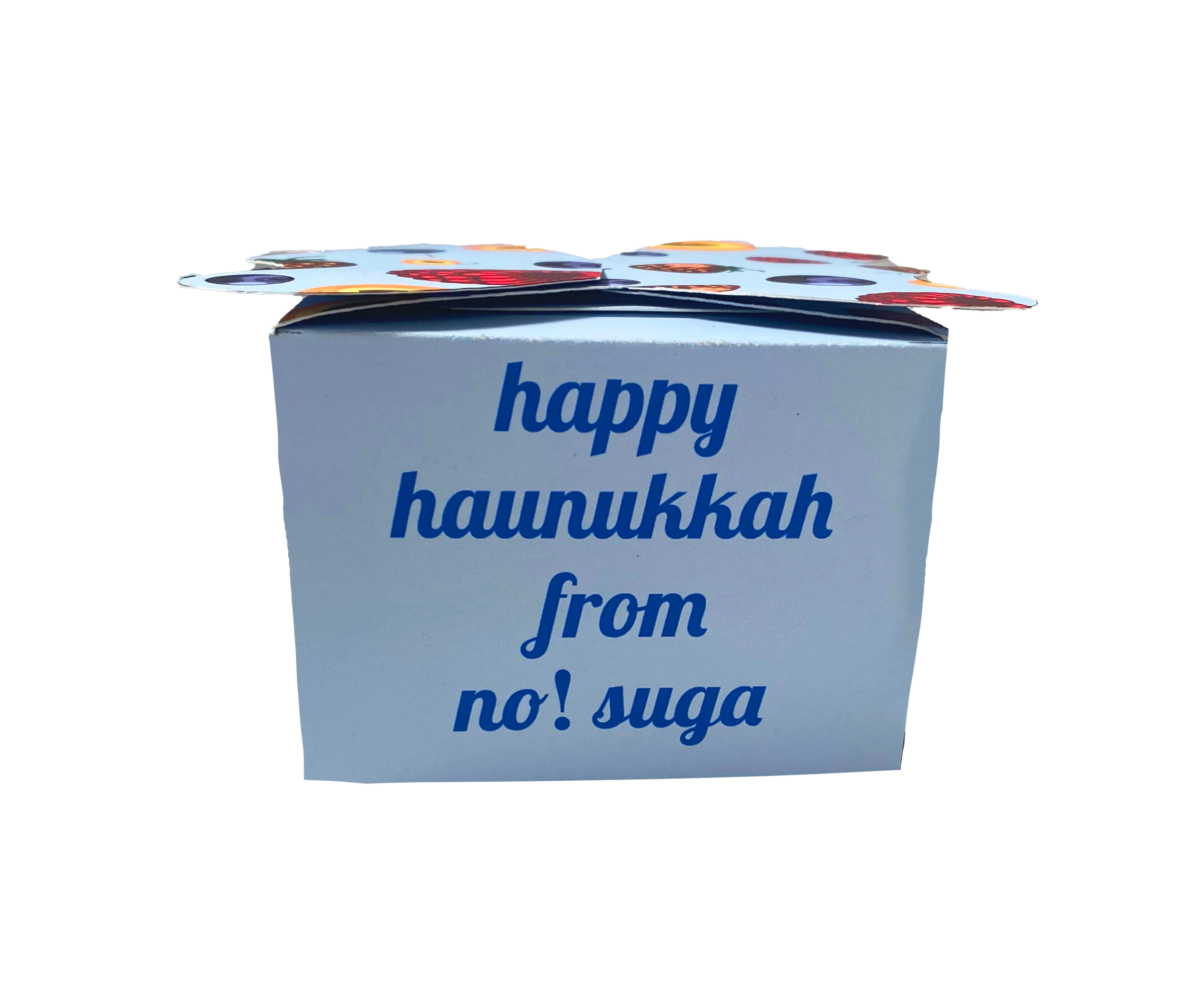
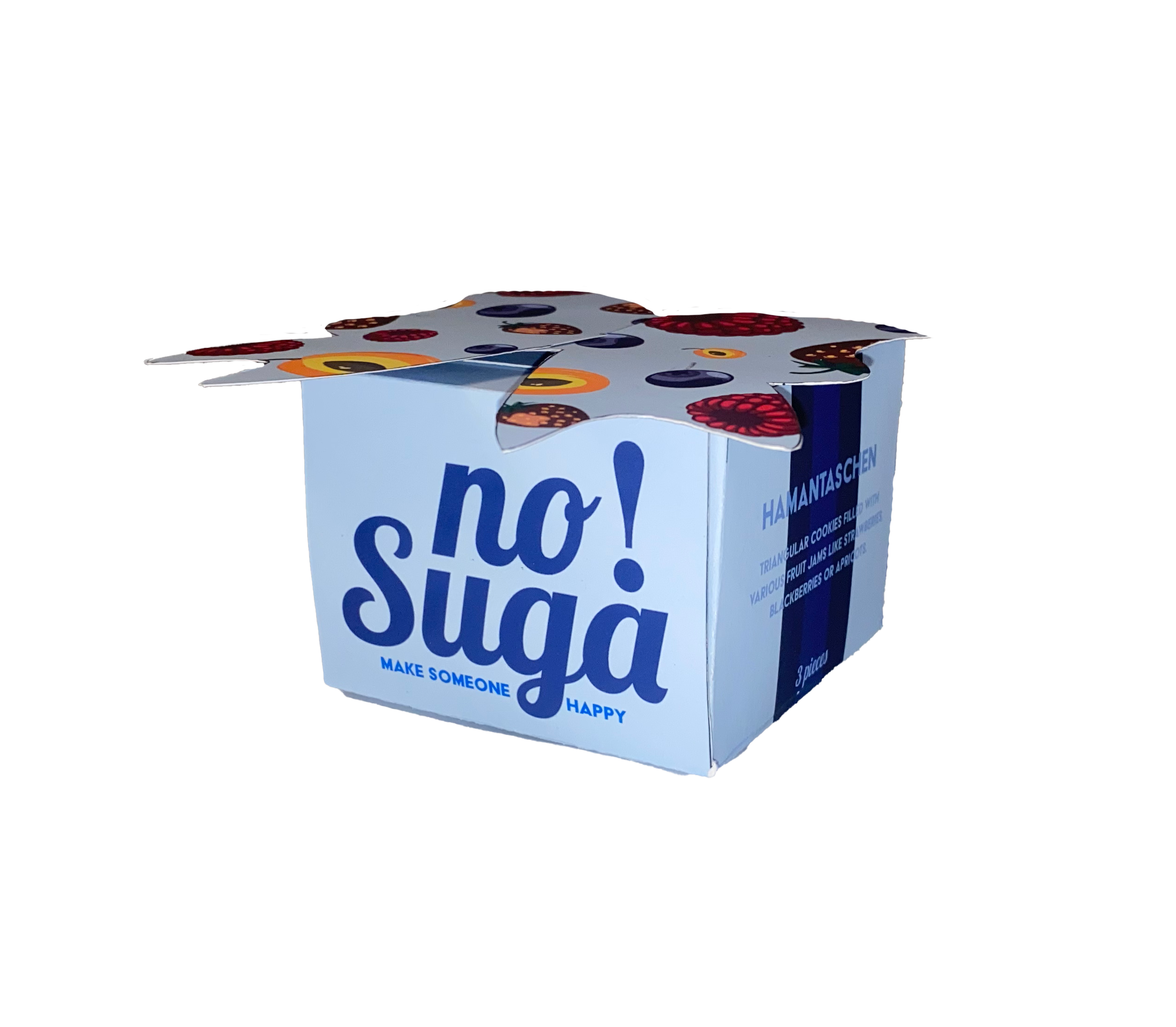
These are specialty packagings I hand-constructed for different holidays. The illustrations on the top were done by my teammate, I designed the layout and the typography. These would be sold for a limited time during specific holidays or for hospitality gifts that the client does for certain events.


These are storyboards of ads that would be posted on social media either promoting existing or new products. I wanted to bring in the element of the floating ingredients but use the product instead. One of the slogans the client had said to us was “Make someone happy”, so I wanted the characters to be in the middle of the rain doing whatever and be happily surprised by the sweets.
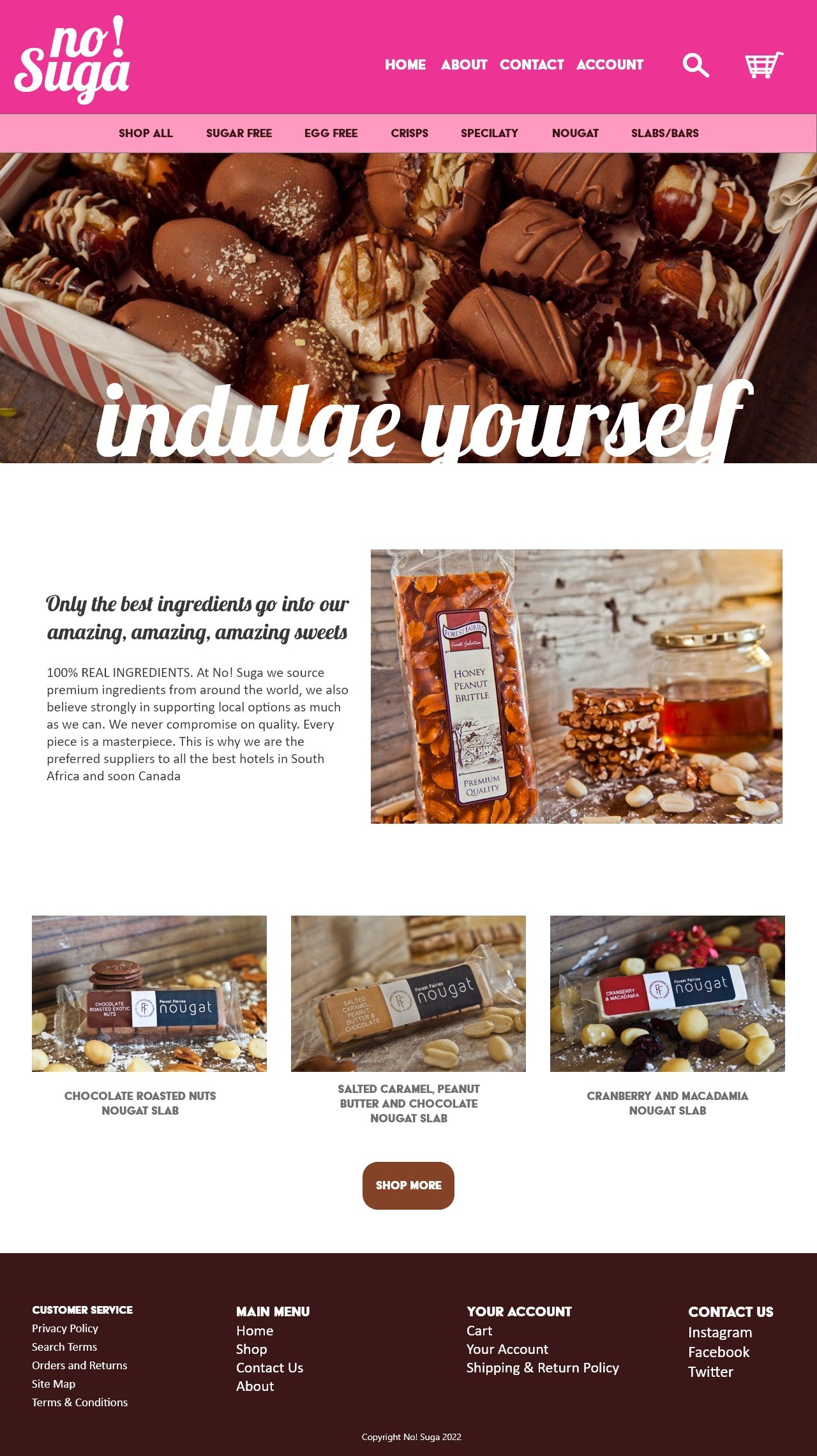
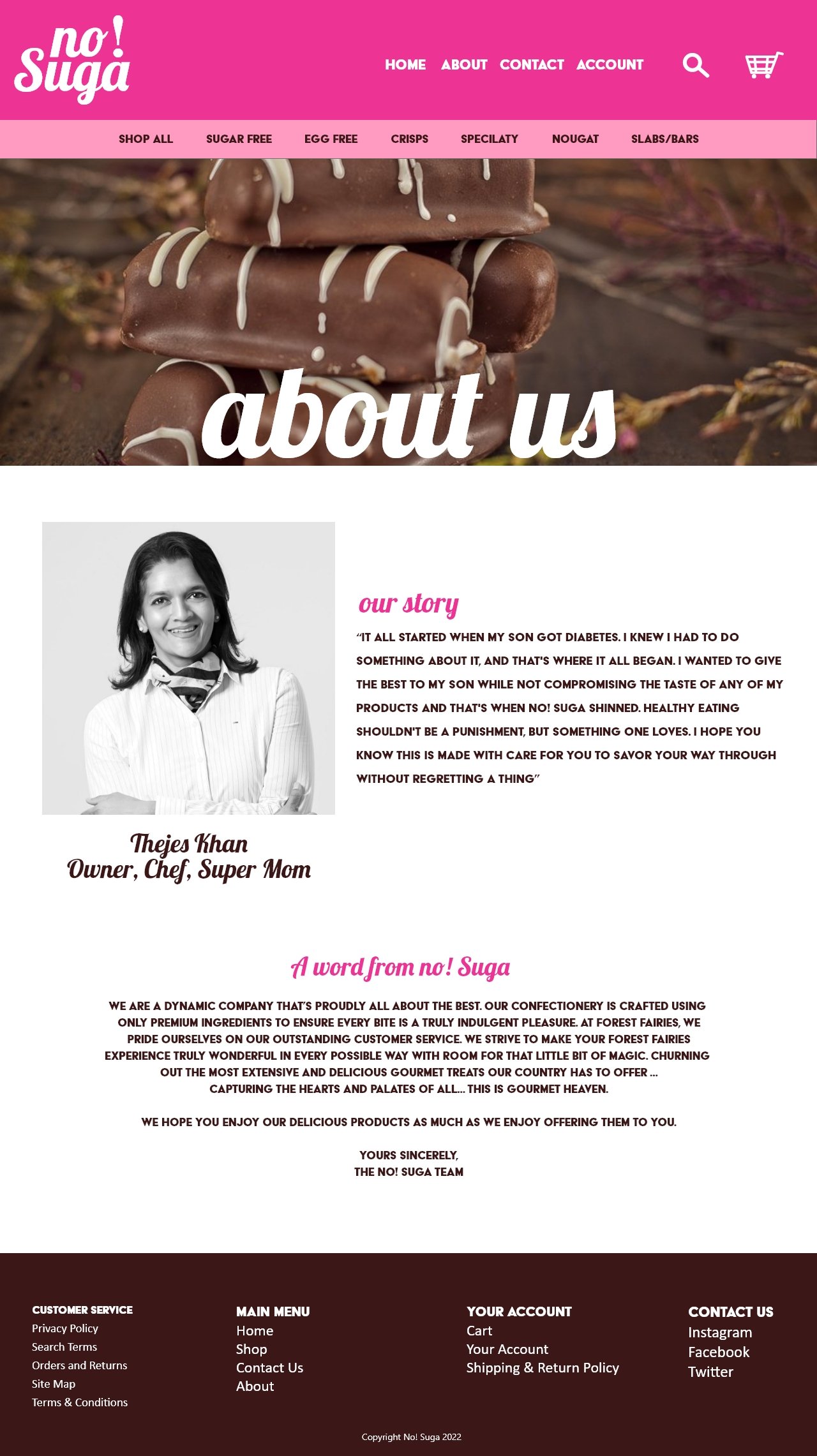

These are landing pages for the client’s potential new website. I wanted to the website to reflect the client’s lively personality and delicious products.

These are the counter displays and end-of-aisle displays designed for grocery stores


